
The Challenge
Our task was to rebrand MOYU in a way that preserved its loyal customer base while attracting a wider audience. The goal was to refine and clarify the brand’s core message, ensuring it was compelling even to those who might not initially be interested in sustainable notebooks. MOYU needed to stand out in a competitive market with a unique and memorable identity.
The Solution
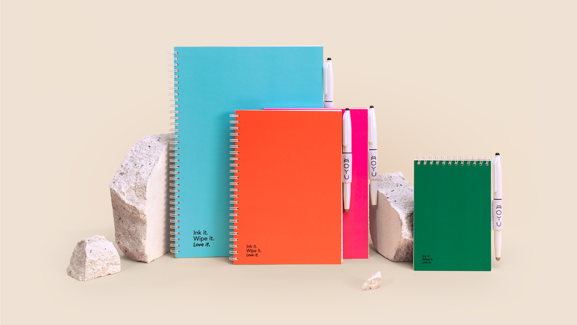
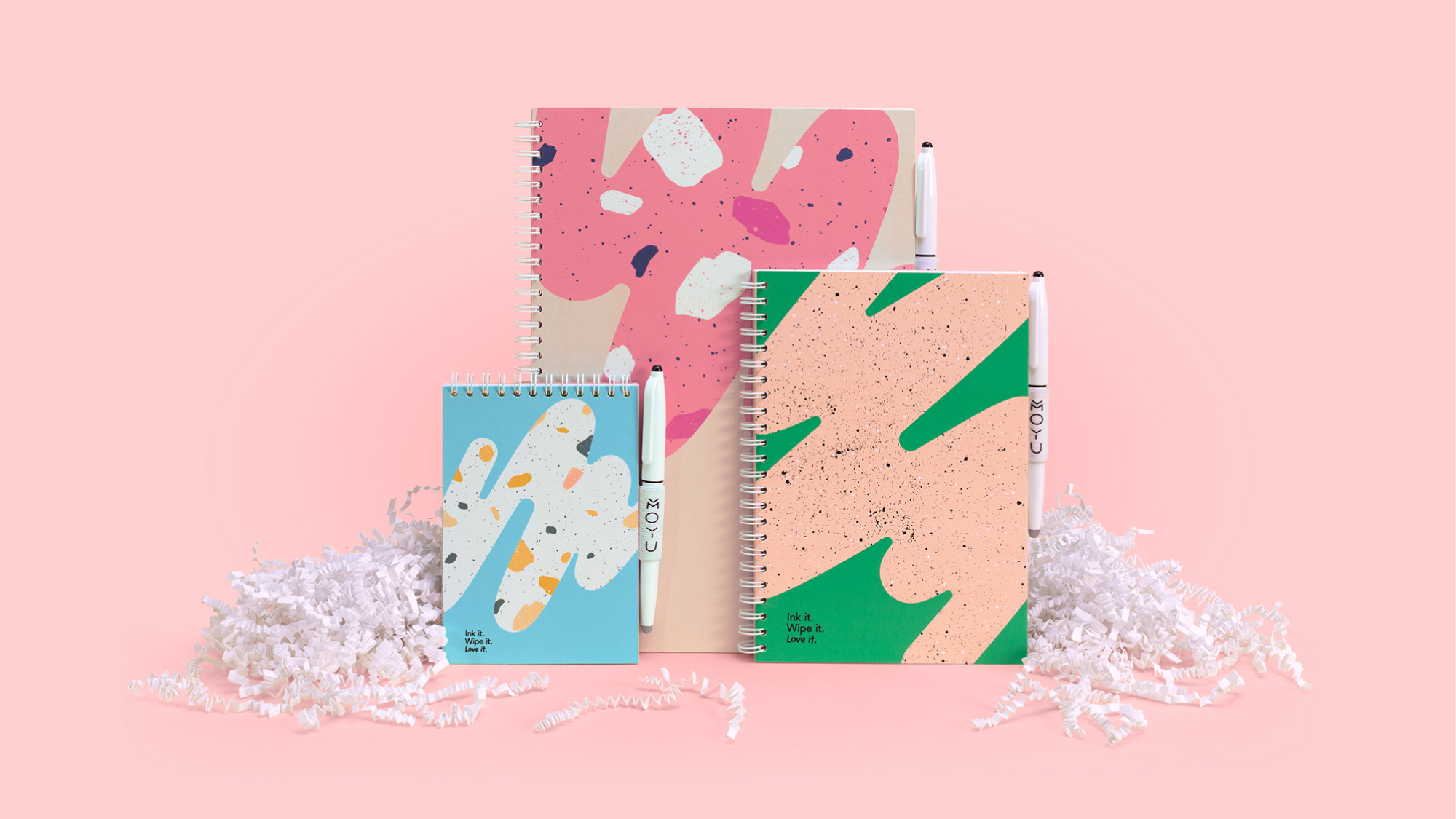
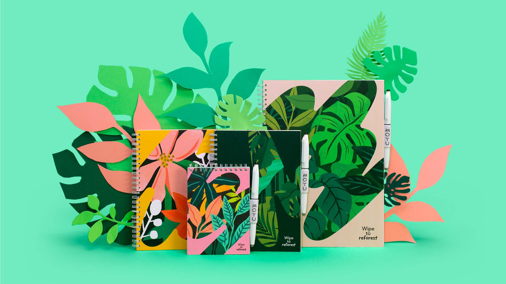
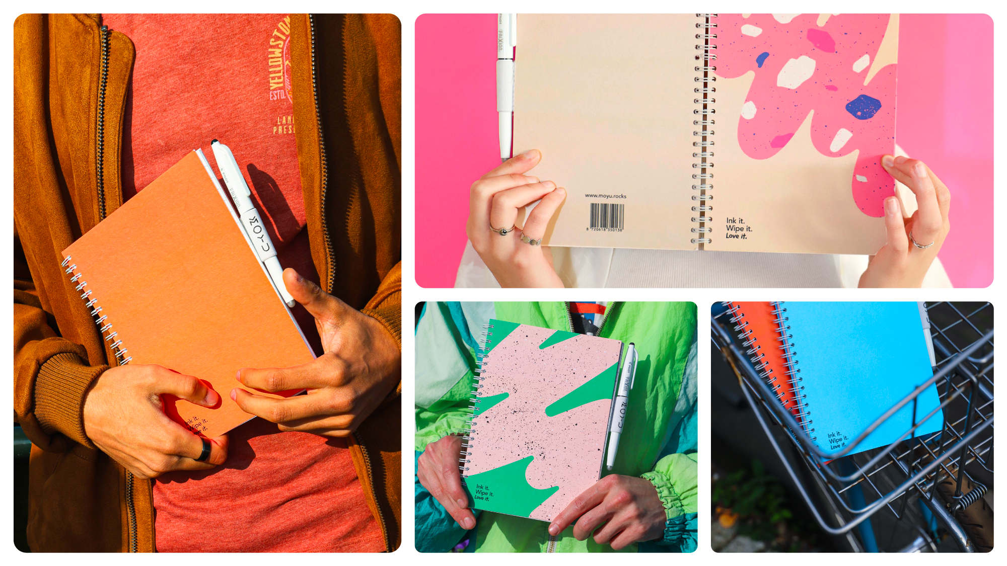
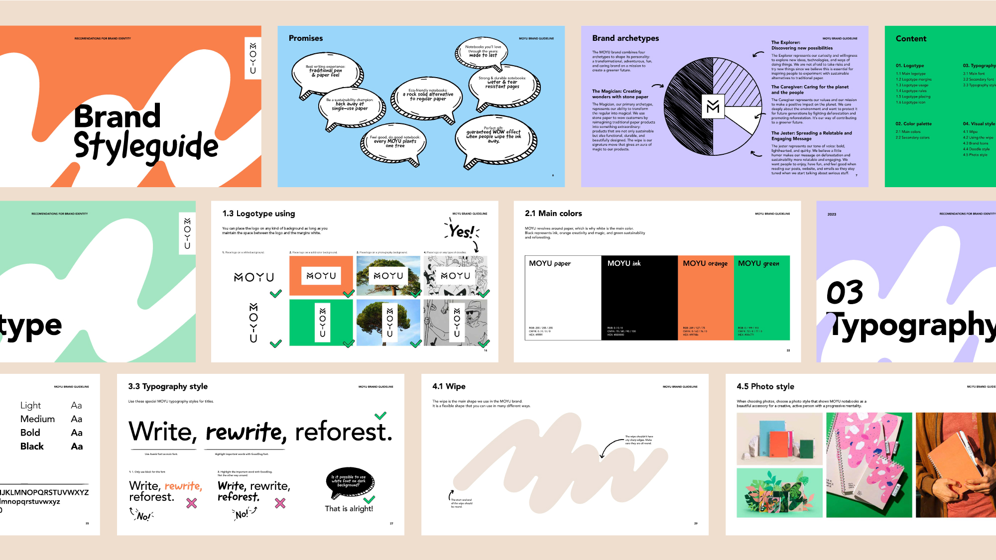
We kept the existing logo to maintain brand recognition but gave MOYU a complete look and feel makeover. We redesigned the brand to be modern, youthful, and fresh, appealing to both existing customers and new demographics.
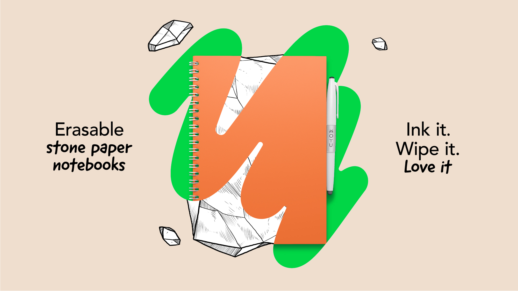
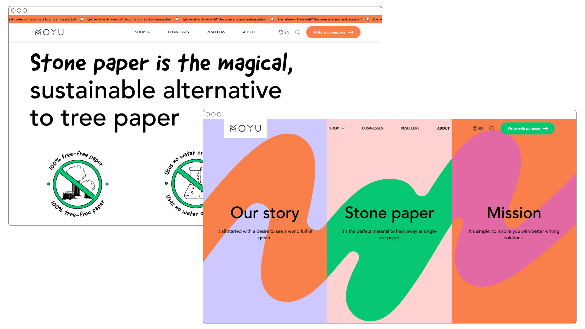
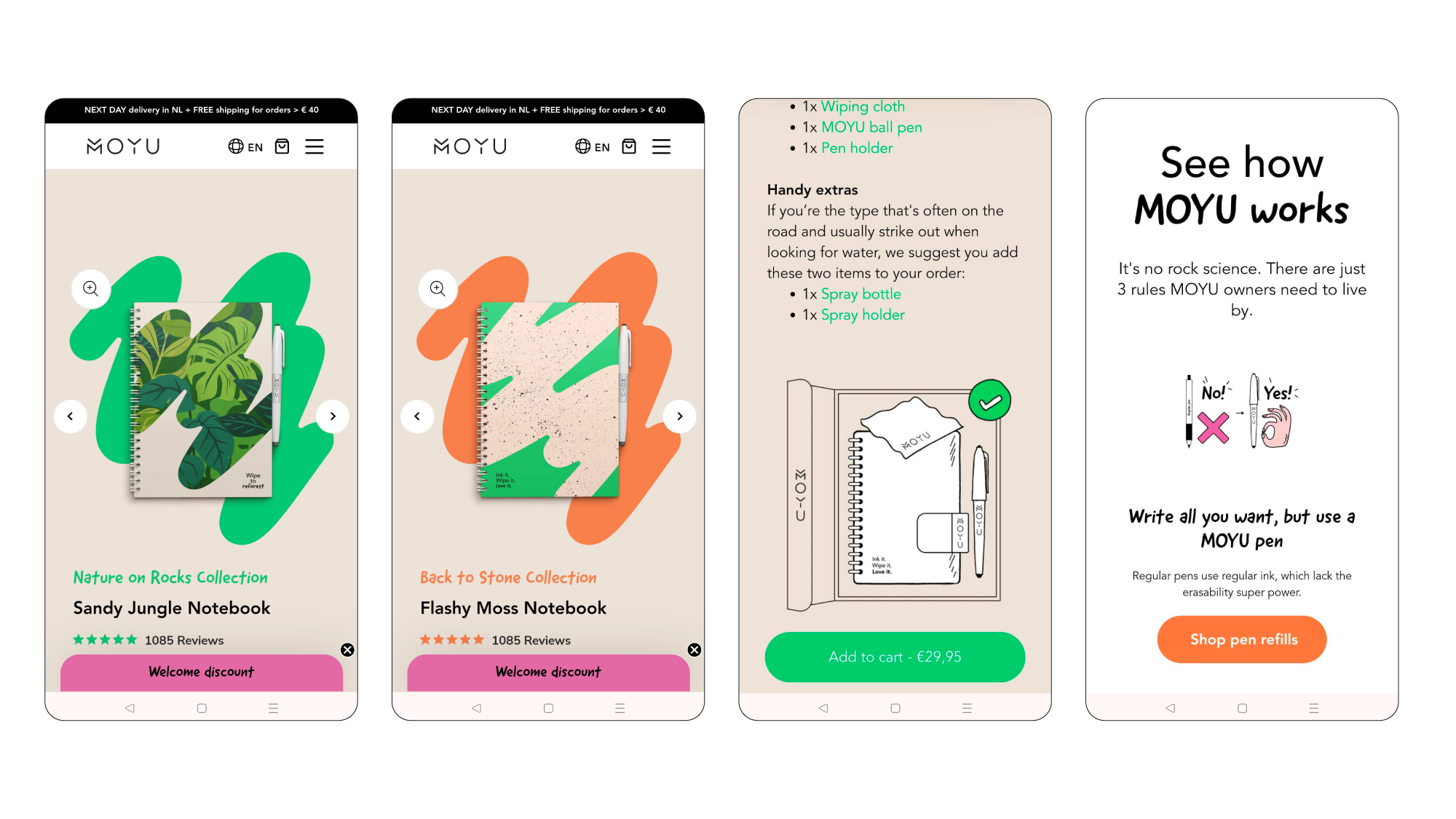
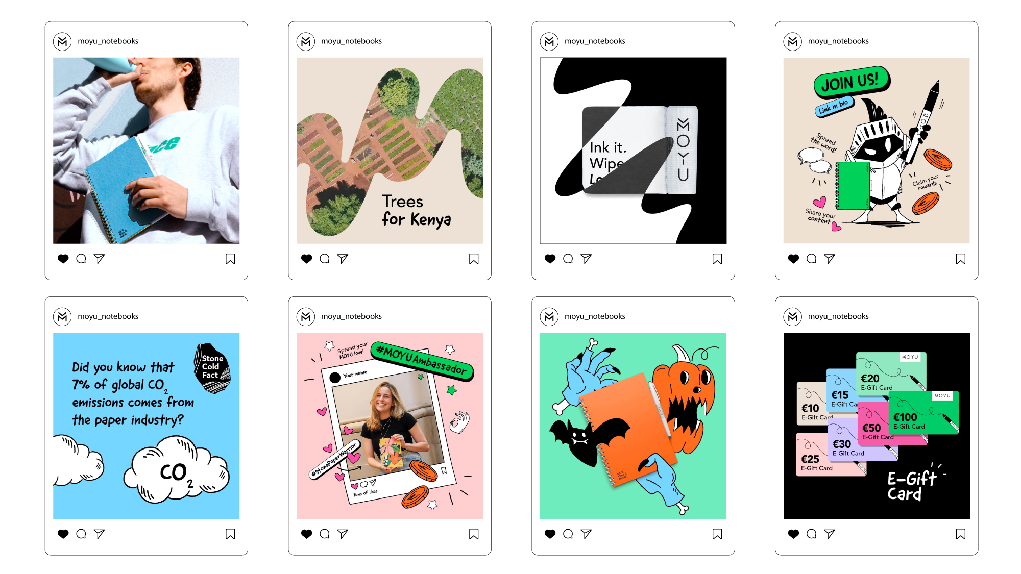
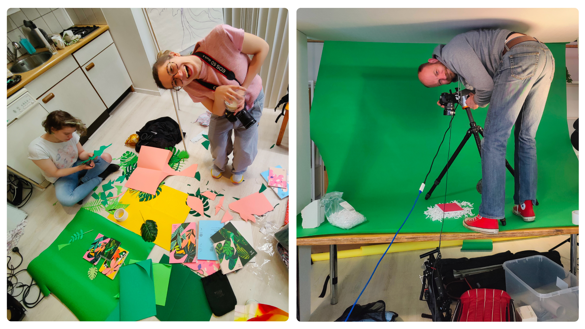
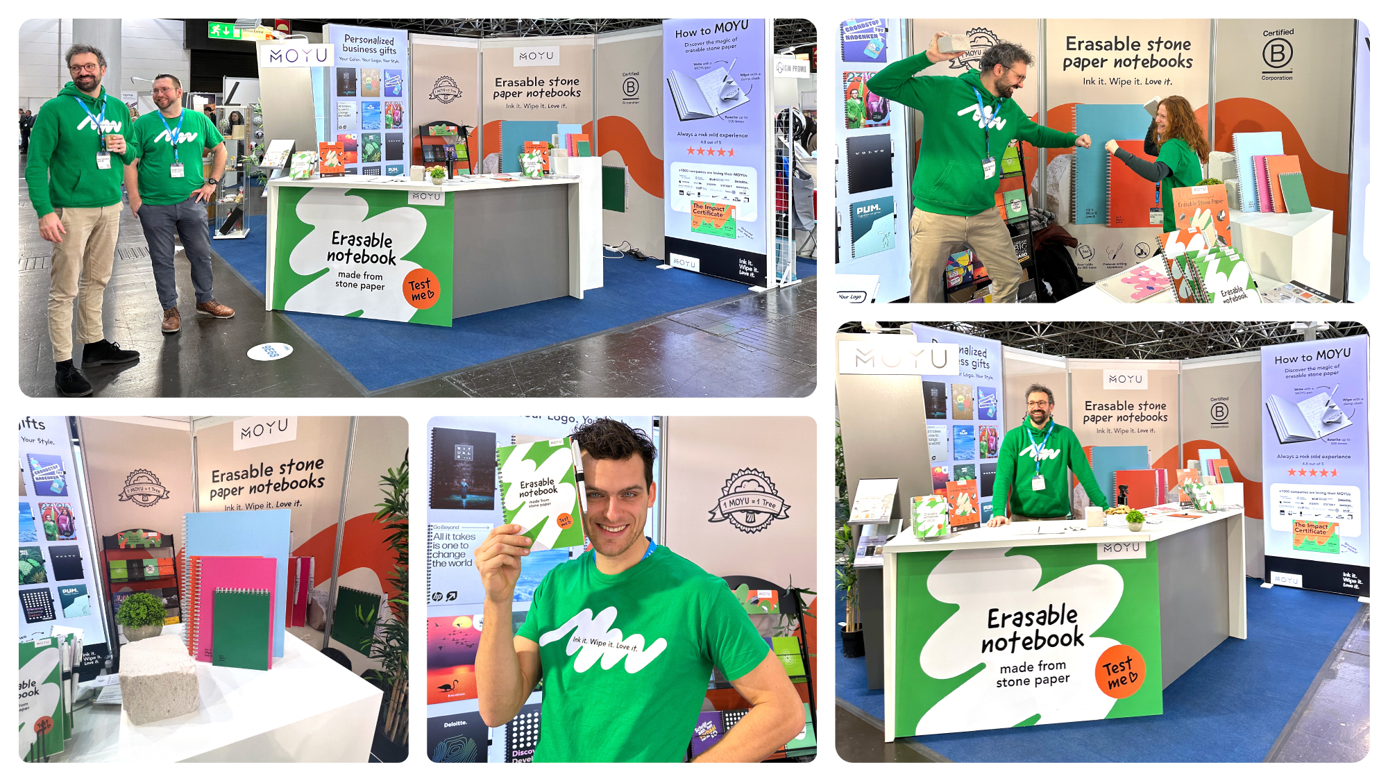
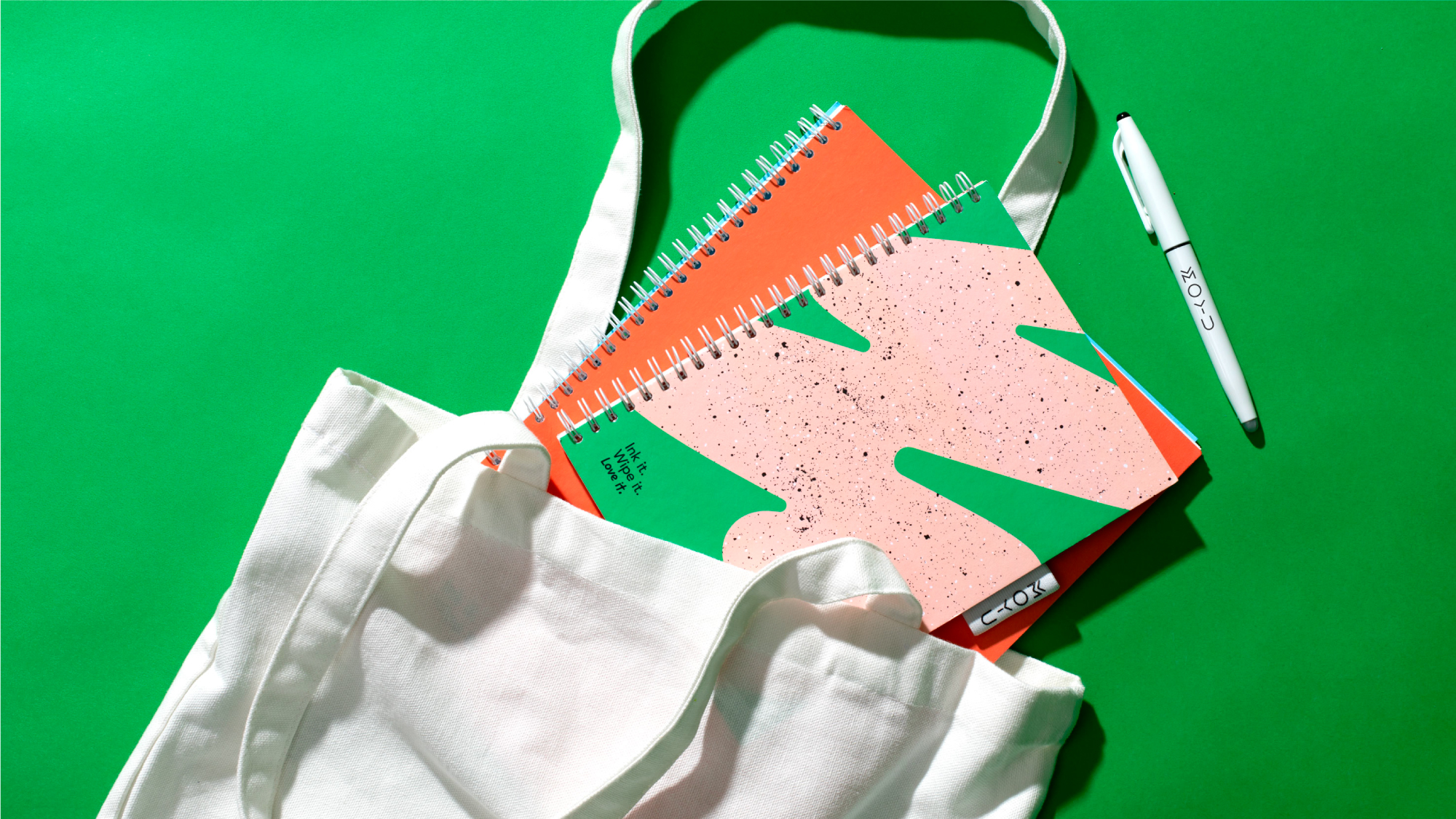
Our creative team—a brand strategist, copywriter, and myself—addressed a wide set of challenges, from revamping the website and webshop to reimagining the notebooks. We introduced new packaging, cover designs, and marketing materials and updated social media strategy to reinforce the brand’s presence.One of our key innovations was dividing the notebooks into themed collections, allowing customers to choose covers that suited their style. It took MOYU from being seen as a sustainable product to becoming a stylish everyday accessory.
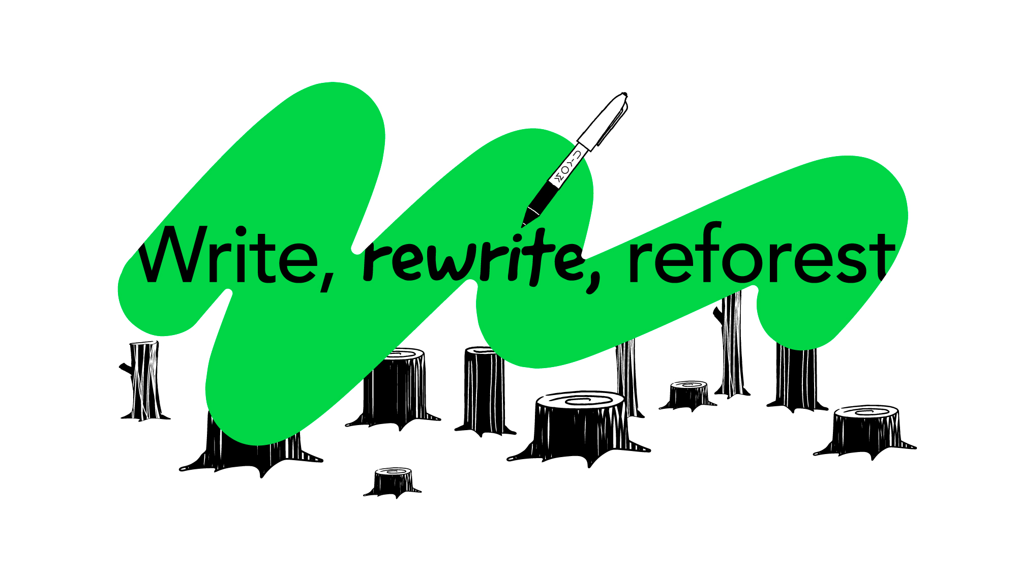
To tie it all together, we introduced dynamic “wiping” graphics that symbolized the reusable nature of the notebooks. These visuals added energy to the brand’s materials while reinforcing MOYU’s story of sustainability and innovation.