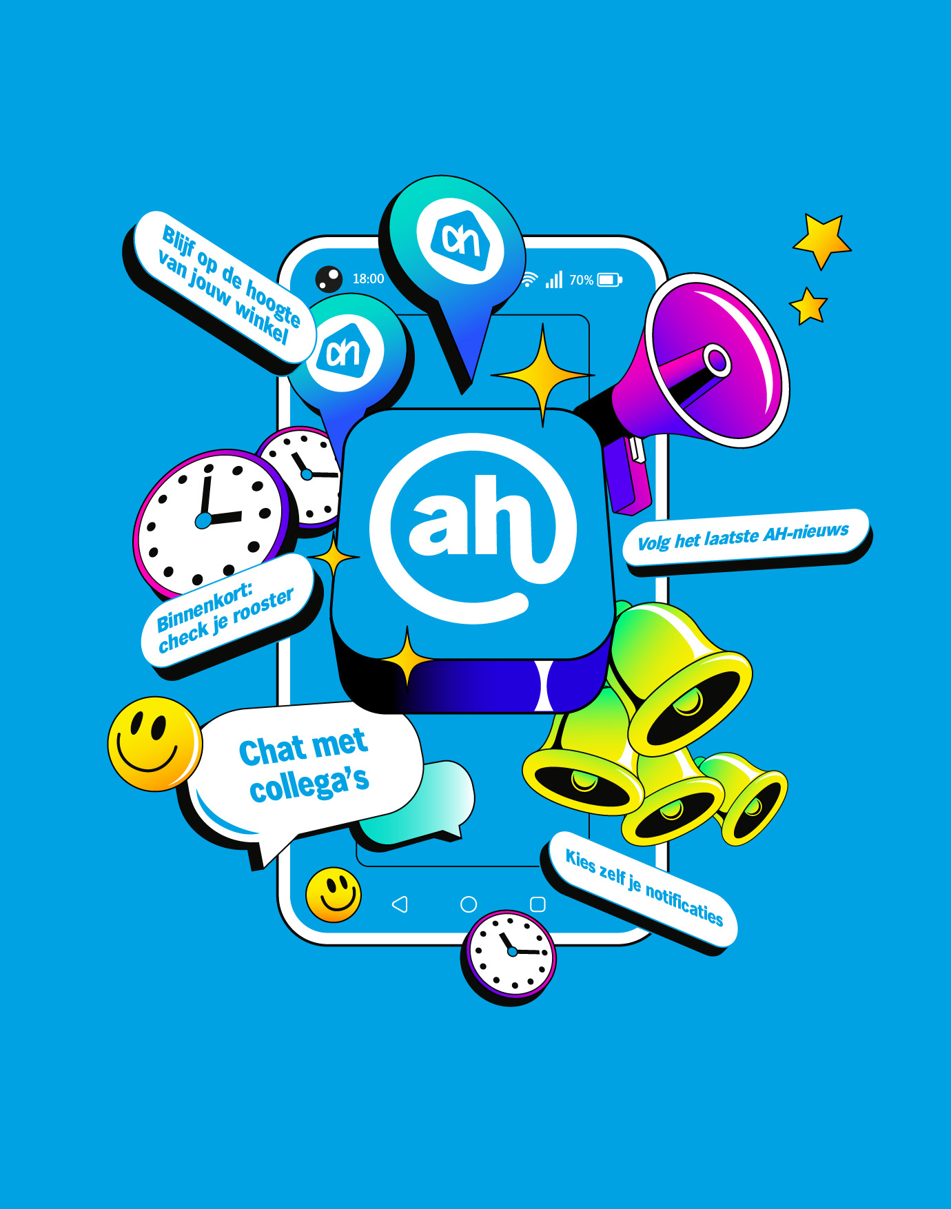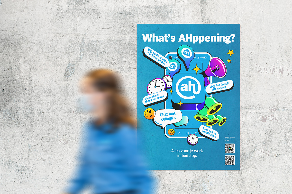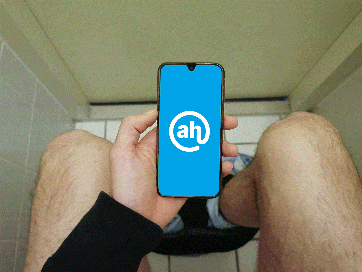

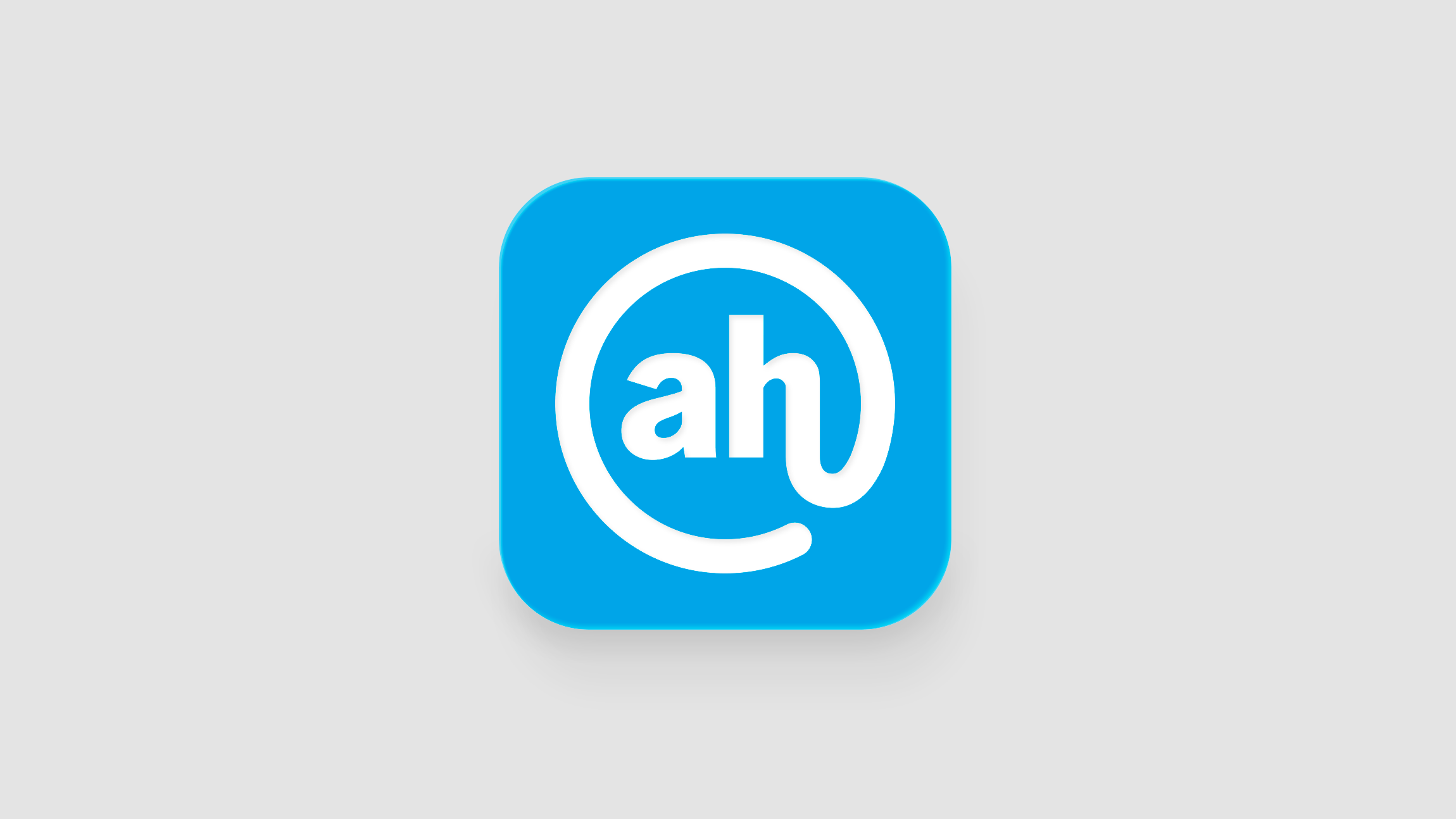
The goal was to create a logo that felt connected to the Albert Heijn ecosystem while still standing out from the other AH applications.
The idea focused on simplicity, recognition, and the “@” symbol itself, creating a visual link between communication, people, and the app name.
The final result was a clean and recognisable identity designed to feel approachable, functional, and easy to spot inside the growing Albert Heijn digital environment.