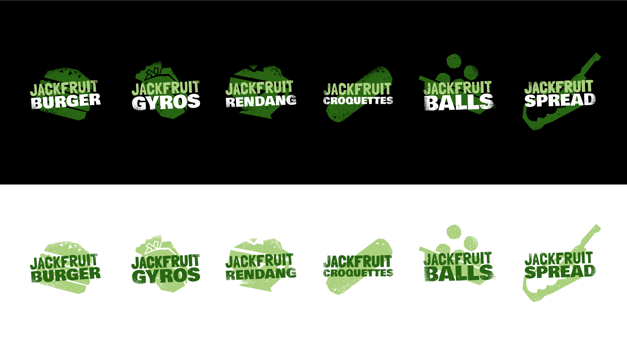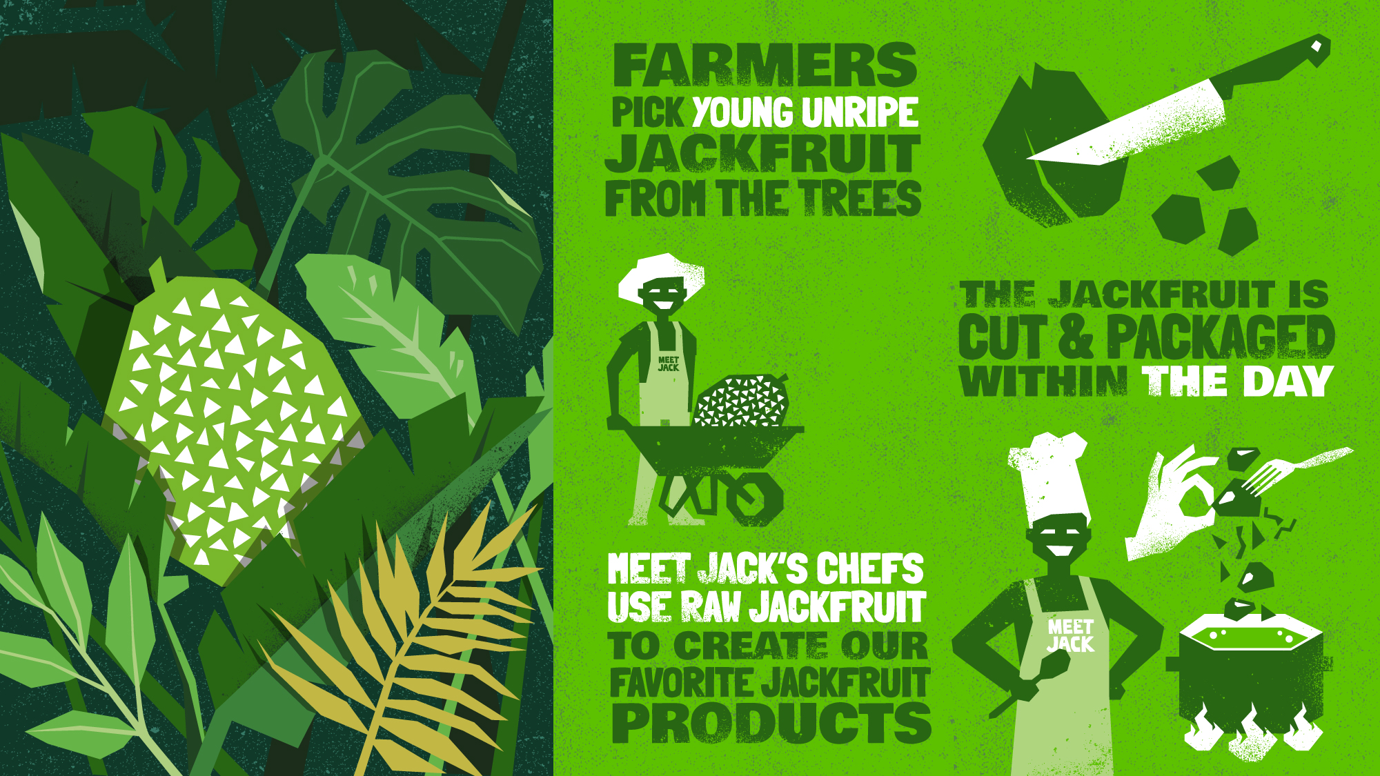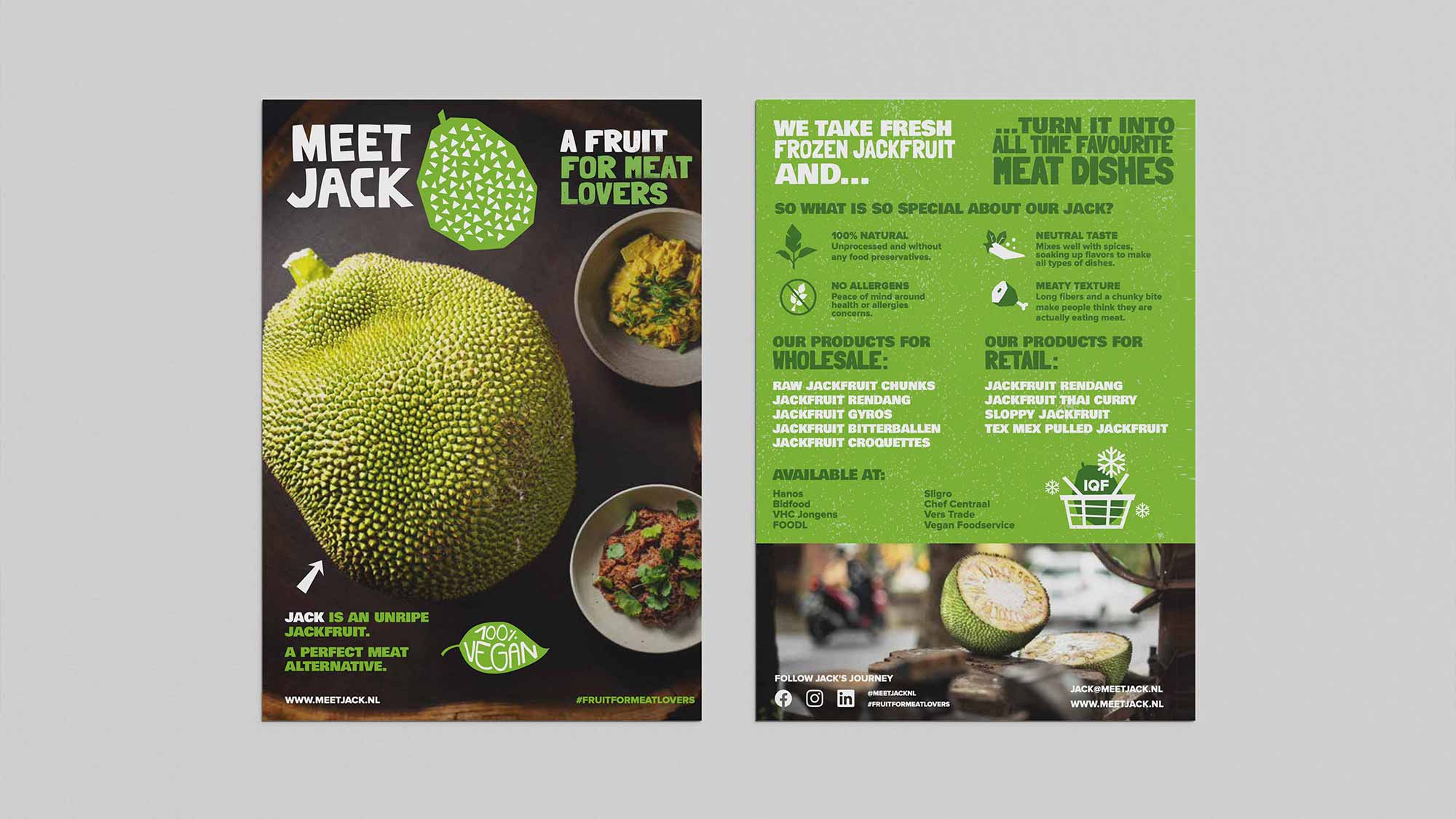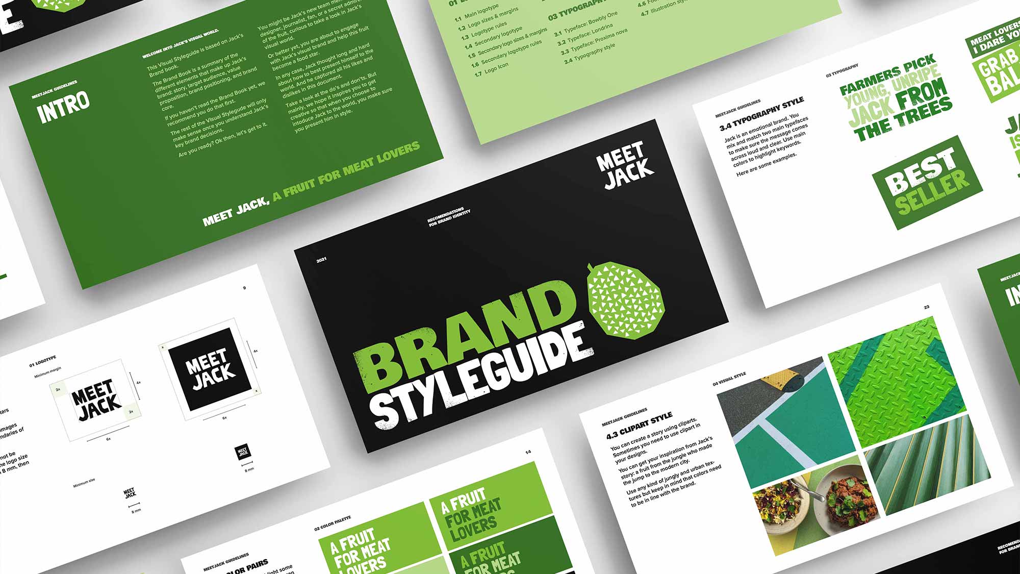

When I stepped into Jack’s team as his fruit-up artist, I had a great logo to work with and an initial set of fonts and colours. The company already established a presence in food industry and was supplying a few wholesalers, but now it was time to consolidate that position and start tapping into a consumer market. Let’s say, Jack needed a whole new wardrobe for the occasion. The challenge was to build upon an established logo, but with retail ambitions in mind, give the brand identity a boost by creating memorable visual communication. Inspired by Jack’s story and his journey from the jungle to the modern city, I developed a rugged urban brand style.
Researching the plant-based retail market, I ran into the issue that many people in Europe are not yet familiar with jackfruit, they don’t know that unripe jackfruit can be used as a meat replacement and that it needed to be very clear that all jackfruit products we make are 100% vegan.
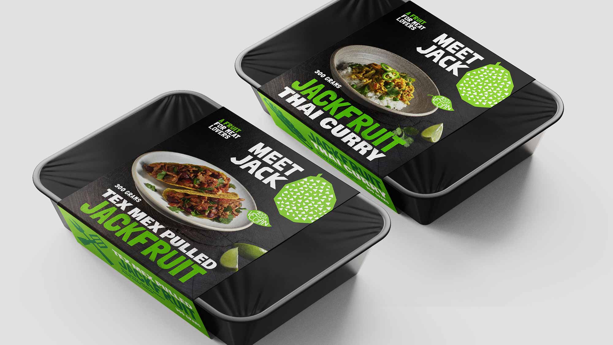
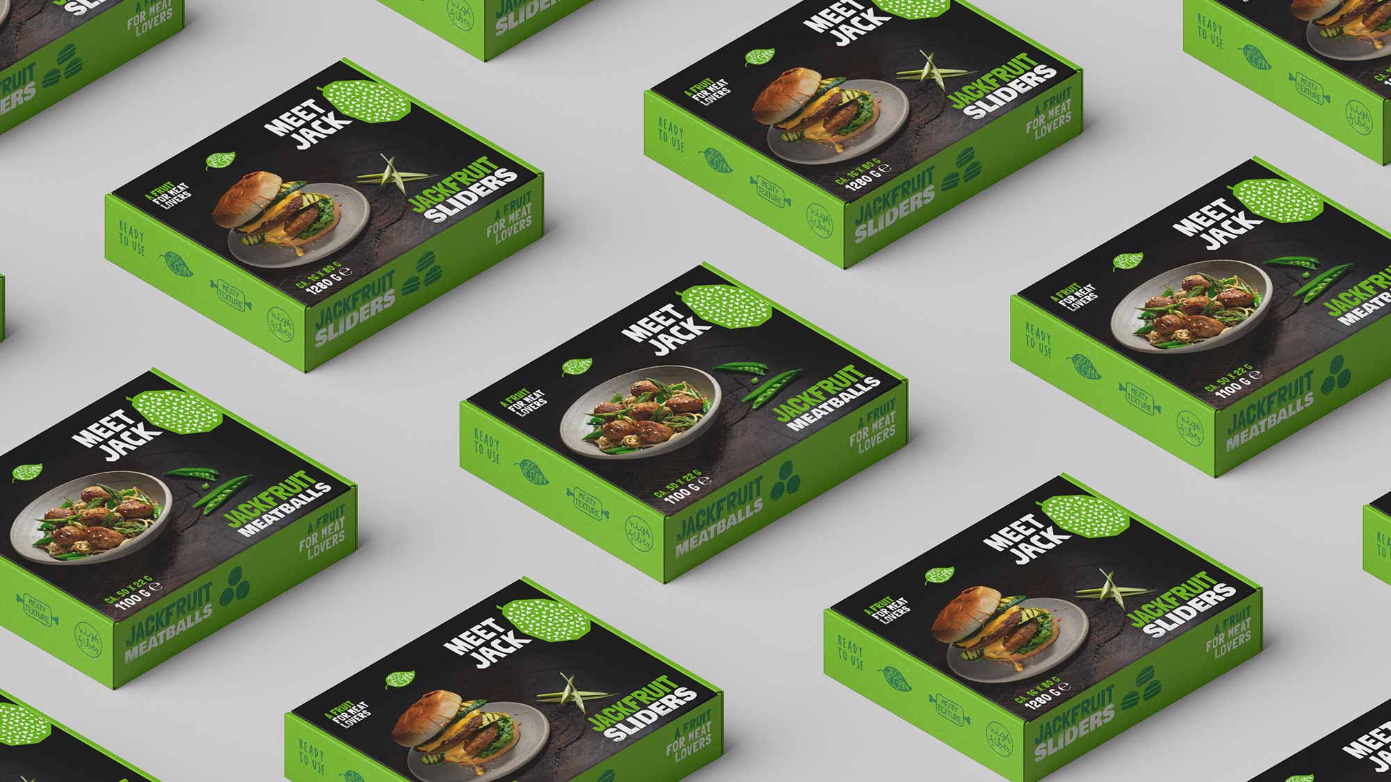
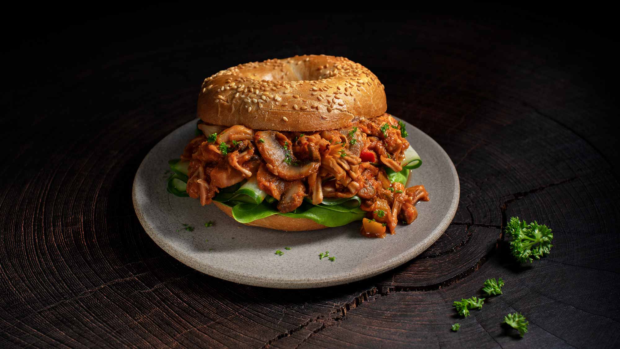
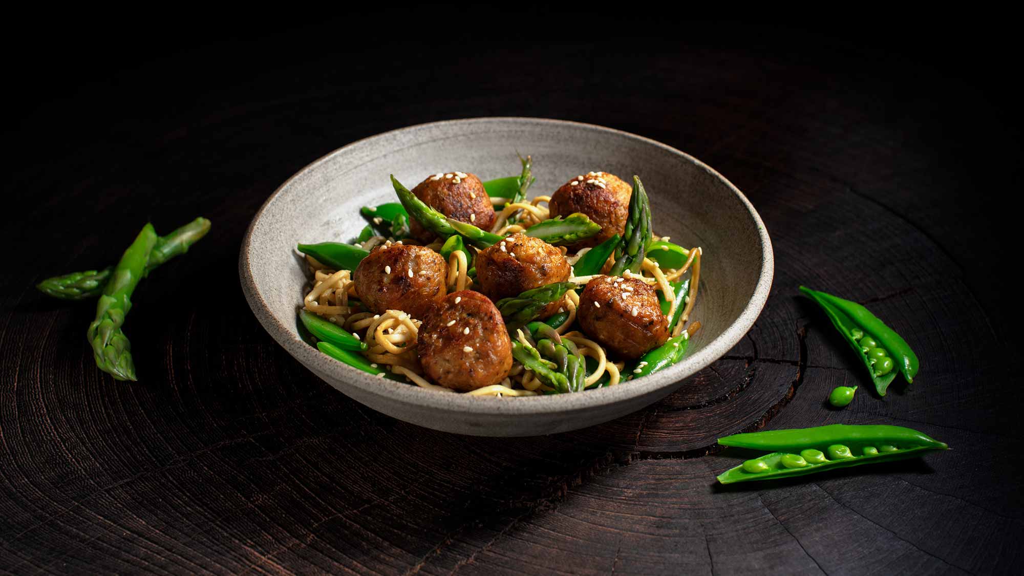
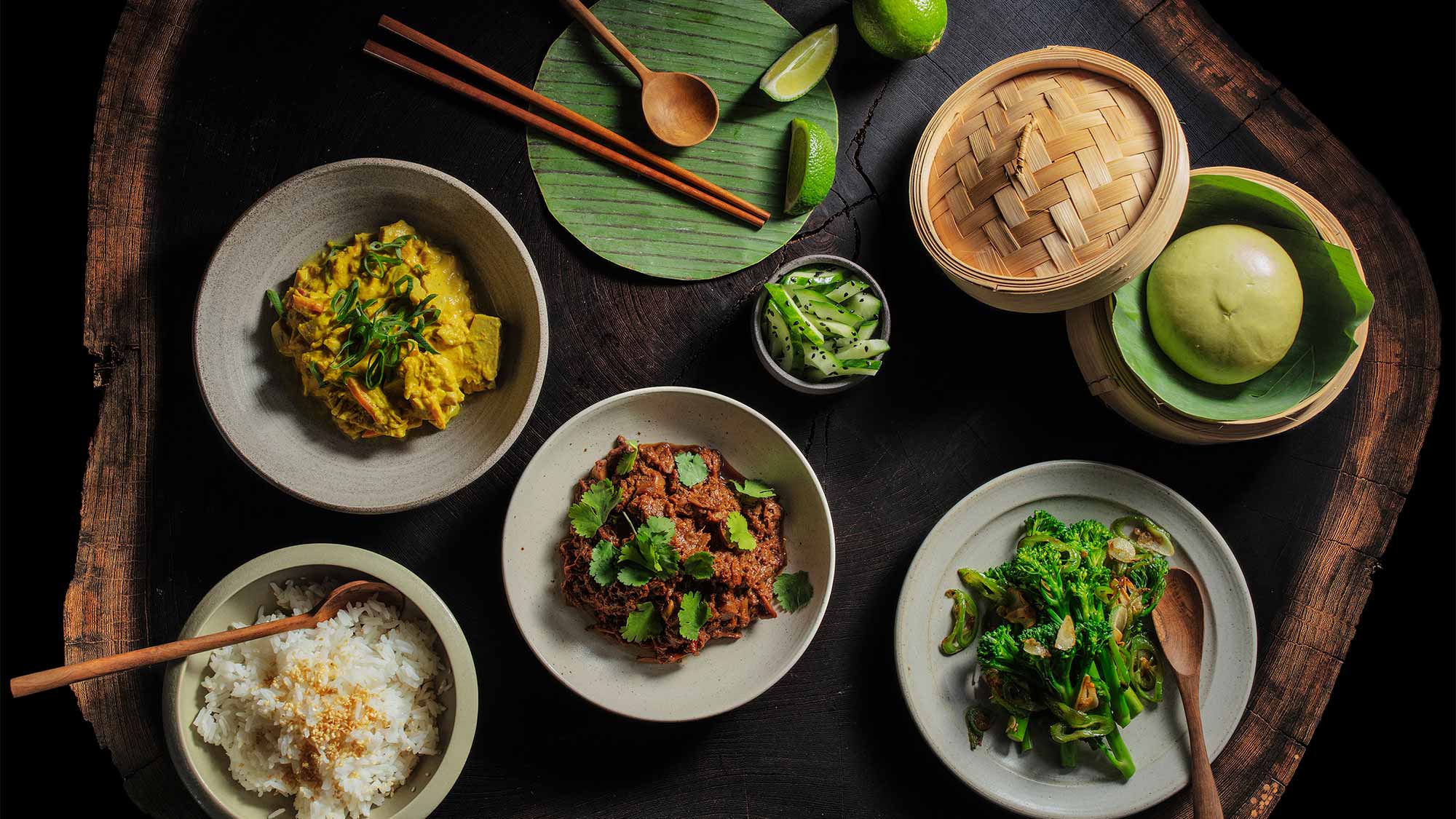
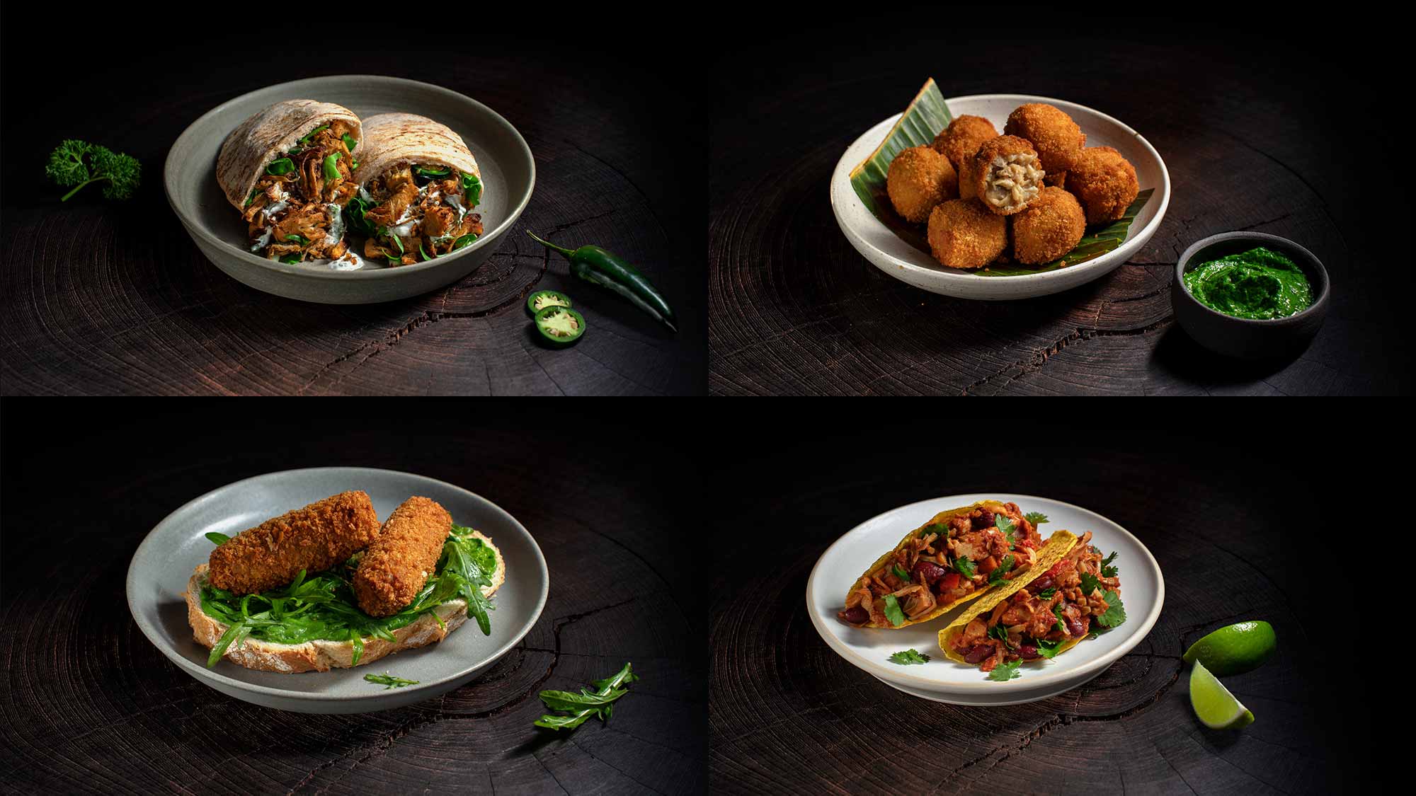
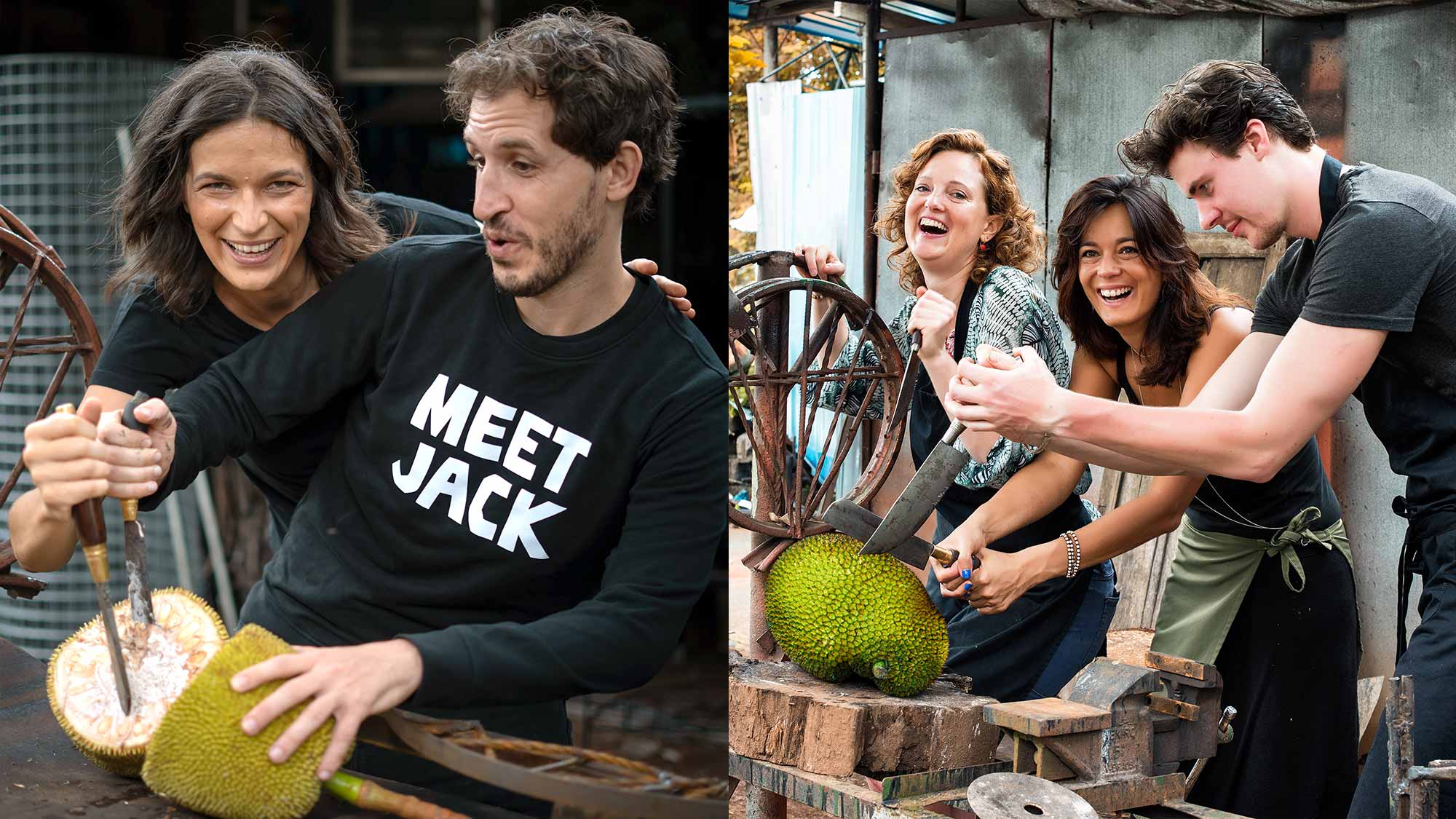
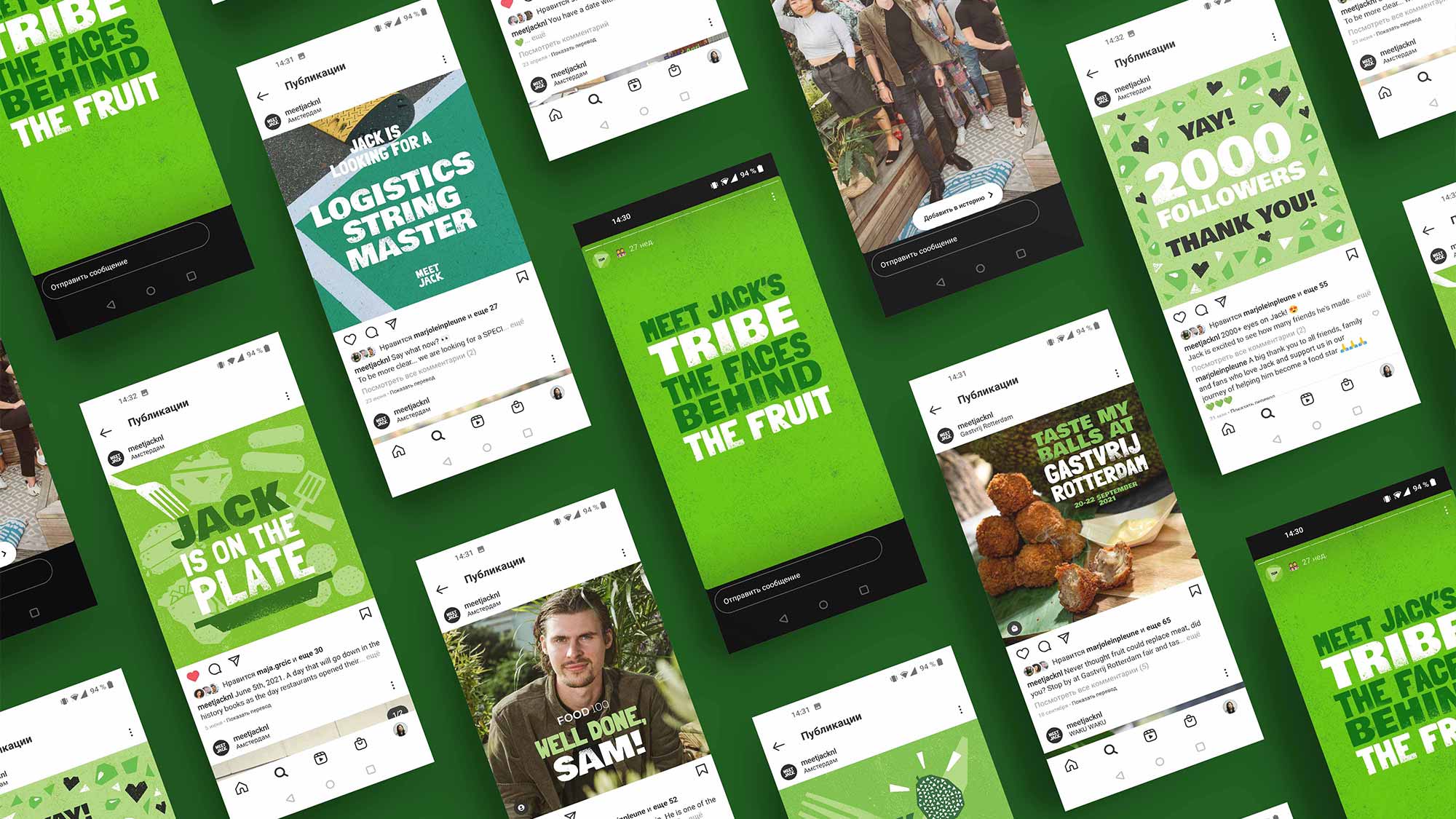
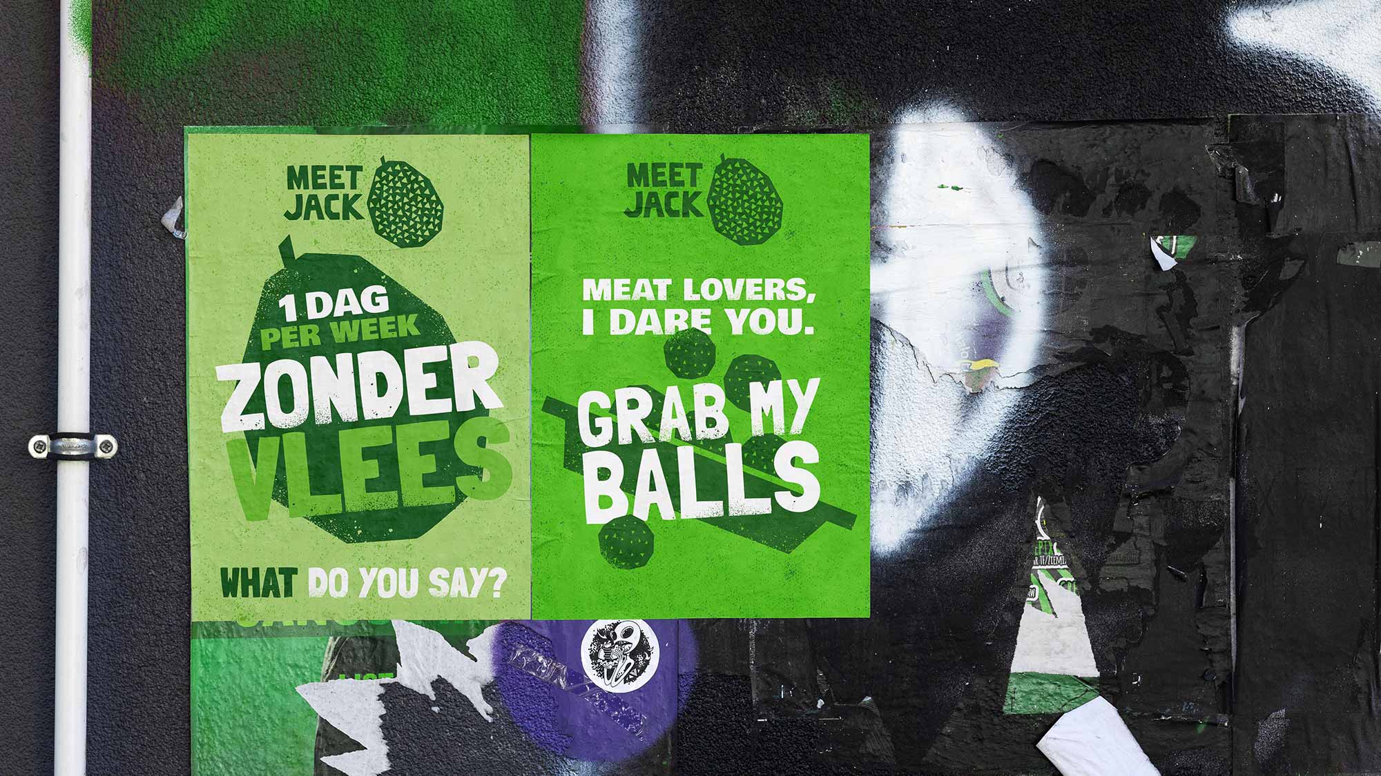
To make our presence stand out and make communication clear, I chose for bold typography system, specific illustration style and strict colour-coding to make people associate green and black combination with Meet Jack. This boldness also translated into our photography guidelines. Jackfruit chunks as presented in logo were an inspiration for Jack’s uniquely chopped illustration style and graphics. Sharp, edgy, playful, but always authentic and a bit quirky. An expressive fruit!
Once we had a visual style, I designed and built Jack’s website, designed packages and stayed on board to bring the brand to life throughout all types of marketing collateral, from posts and brochures to decks and event spaces.
Take look at more work at meetjack.nl or my Behance profile.
Happy to announce that this case featured in DesignRush.